Besides great service, product and local knowledge, what else are you offering your customers?
That is the number one question we ask our clients when they call us about a store remodel or design project. Your customers already know that you sell shoes and apparel and likely provide them with great service, but is that enough nowadays? I would argue to say absolutely not.
When is the last time you’ve walked out of your store, opened the front door as if you’re entering for the very first time and tried to assess your store experience as a first-time customer? I recommend that all store owners try this exercise — soon.
When you walk in for the very “first time,” I wonder if it is clear to you where the men’s product stops and the women’s starts. Are you able to stop for a brief moment right inside the door to take the whole space in, whether it’s a 1500- or 6000-square-foot space, so you have clear lines of sight to chart out your plan for exploration of the whole space?
Is there anything that draws your eye throughout the store to notice some key focal points strategically placed or are you immediately lulled into a trance of messy product confusion, where nutrition is crammed in next to socks, next to shoes and with brand signs dating back to the 1980s stuffed in every square inch, in between medals you won in college and race bibs from the first 10K you ever ran?
Don’t get me wrong. I enjoy some old running memorabilia as much as the next potential customer, but there’s an art to making it look intentional in your store as opposed to just squeezing it in like a yellow pages ad, wherever you may have an empty square inch on the wall.
These are some of the subtle nuances of well-designed stores that owners have thought through and strategically implemented. There’s a reason you walk in to a Target to buy a notebook but leave with a cart full of items without even knowing what hit you.
There are no coincidences in great retail. It’s very strategic — from the vibe you feel as soon as you open the door, to the signage, lighting and fixtures, to the traffic flow that’s created by the layout. And it continues all the way down to how every piece of product is hung on hooks, fixtures or folded on shelves.
Sound overwhelming? Let’s break it down in to a few key areas that you can sink your teeth into.
General Store Layout Tips
Have you stepped back and actually developed a logical strategy for what product categories go where in your store? If your answer is no, here are a few important but simple things to consider.
- Balance throughout the space. If you have your three busiest categories all placed very close to each other in the store, you’re likely not doing a very good job of creating balance in your traffic flow. For instance, we like to separate men’s and women’s footwear so that you can spread out the traffic in the space. Nobody likes to feel crowded when they’re shopping and having footwear separated by gender helps give everybody some breathing room in the store.
- Spacing between your floor fixtures. Ideally, you’d like to have 36-40 inches between each fixture, but you can go as tight as 30 inches if you’re really short on space. Any closer than that and you’ll make your customers feel uncomfortable as they walk through the crowded floor and, consequently, they’ll avoid browsing altogether. The less they browse, the less they spend.
- Product adjacency. Have you been strategic about complementary product categories being merchandised near each other? Make it easy for your customers to add on their own sales instead of forcing them to dig through your displays to find what they’re looking for.
A simple mistake that we frequently see is people merchandising their nutrition next to body lubricant or detergent products, both of which are obviously not edible. Yes, they come in similar type packaging, which is all the more reason they need to be separated in your displays. I once attended a bike race where they were announcing all day that the chamois butter sample packs were not to be eaten like the Clif Bar frosting samples that were in a similar package. You see where this is going.
An example of a great product adjacency might be placing your compression category next to your medical recovery. They are potentially serving a similar customer need. We also like to double merchandise hot-selling socks near the checkout since that’s an impulse buy that never fails.
- Sightlines. Can you stand at the front entrance of your store and clearly see all of your product categories? Do you have fixtures, walls or displays blocking key signage or product? These types of things can both frustrate your customer as well as invite them to steal a small accessory or energy bar that may be tempting.
- Focal Points. A key piece of the great store design puzzle are focal points to silently pull your customers throughout the store. These may be large signs, graphics, accent colored walls, mannequin displays or any other sort of visual cue that helps your customer better navigate your space. The key is that these things are happening without the customer even knowing.
I go back to that Target example. It’s like a Jedi mind trick, where your customers are getting drawn to areas that will appeal to them and, before they know it, they’ve got a stack of irresistible add-on sales because your focal points grabbed their attention as they explored the space.
The Role of Signage, Lighting
Often overlooked by retailers, signage and lighting can have a huge impact on the customer experience. In addition to good general lighting (the lights that actually make your store bright when you flip the switch), track lighting to bring life to the wall and feature displays are equally, if not more, important to the success of your store design. Professional lighting is well worth the investment and running to Home Depot to grab something that’s on sale doesn’t cut the mustard in today’s retail world.
Signage is a category that is often an afterthought, yet it’s the one easy storytelling process that can take place while your staff members are busy helping other customers. Clients often say to me, “Well, don’t you think our customers know what a pair of gloves are without a sign that tells them?” To which I reply, “Sure thing, but if they came in looking for shoes and as they’re waiting for their size to come out, they look around the store and see a sign catches their eye that says gloves, it might get them thinking about taking a look before heading out since it’s cold outside.”
The idea is to quietly plant ideas in your customers’ heads. Get them thinking above and beyond the one thing that brought them into your store in the first place.
Finally, apparel — the hardest category for all run specialty stores to merchandise and sell. How do you sell apparel in your store when your customers can easily find that same product online or in any number of other stores?
Well that’s easy — get them excited! Remember, no customer has ever walked into a running store planning on buying a new pair of shoes, new shorts with a matching top, a cool new hat, a vest and a couple pairs of socks. Nope, they come in to buy those shoes and it’s your job as a store owner or merchandiser to get them emotionally connected to your displays and so excited about the apparel you have that they’re compelled to bring some home.
We’ve had incredible success with this category in run specialty stores by bringing in mannequins (lots of mannequins), merchandising full outfits with accessories (yes, put handhelds on the mannequins as well as hats, socks and anything else that fits) and by making the apparel section look very well curated instead of like a dumping ground for clothing.
By “very well curated,” I mean be selective as to what you’re putting on display. You simply can’t be everything for everybody, so figure out who your target customer is and be very intentional on your apparel buying and merchandising for that market.
Feature a couple hot new outfits on your mannequins and put the stock for these outfits right next to them in a clean, simple display. The moment your walls and fixtures become lined with apparel, your customers get overwhelmed and decide it’s easier to avoid it. Less is more and doing the work for your customer in this category is what’s going to inspire them to buy more.
Remember, your customers are the same ones who are shopping at Whole Foods, Anthropologie, Apple stores and all the other high-end retailers out there who are now competing with you for their dollars.
Give them the same high-end retail experience when they enter your store that they’ve come to expect elsewhere and you’ll give them a reason to keep coming back for more instead of going elsewhere or online.
About the author
Holly Wiese has more than 25 years experience in the field of visual merchandising and retail design in specialty running, specialty cycling, outdoor, active apparel, women’s fashion and collegiate bookstores. Before starting 3 Dots Design, Wiese consulted in the bicycle industry where she oversaw all aspects of retail design and visual merchandising for Giant Bicycle.
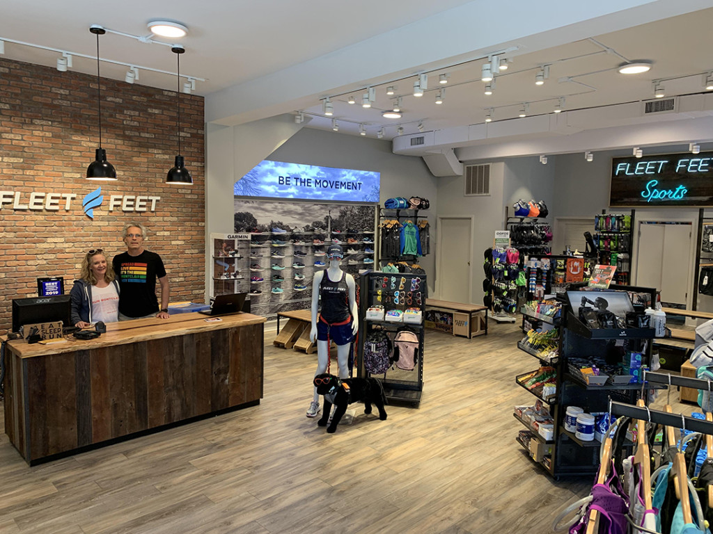
In addition, Wiese has designed and merchandised for such brands as Pearl Izumi, Shimano, Fleet Feet, Electra Bicycle, Cervelo, Moving Comfort, Club Ride and Hind Sportswear, as well as a vast number of specialty run and bike retailers across the country. Recent design projects for 3 Dots Design include the newest Fleet Feet flagship store location in Austin, TX. For more: [email protected]; www.3dotsdesign.com